

All the Colours of Stone
Eight Materials, Infinite Mood
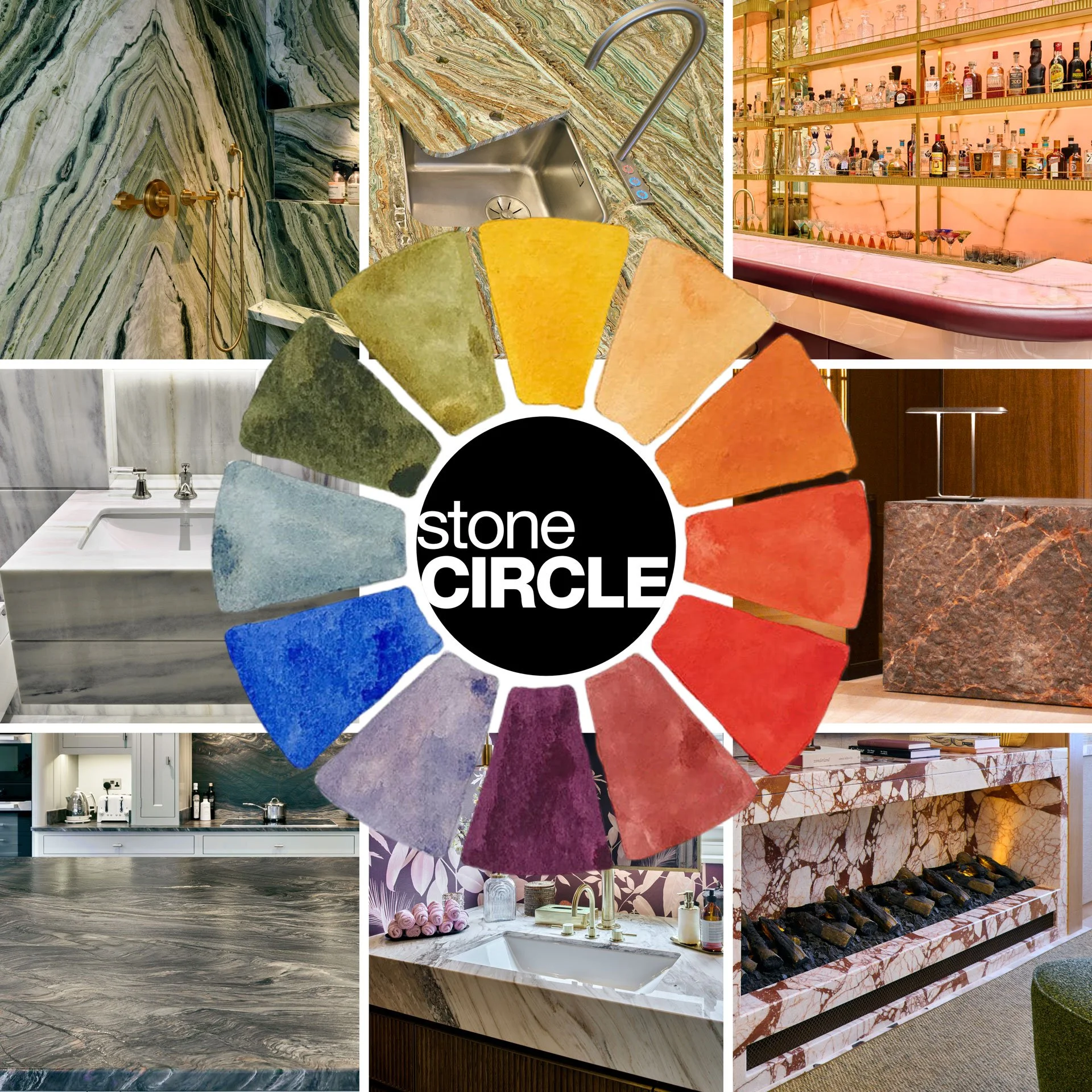
Colour in stone isn’t applied. It’s revealed.
Every vein, cloud, and mineral band is a record of pressure, time, and chemistry, turned into a surface you can live with, work around, and build an atmosphere from. That’s why we’ve paired eight stones with a classic colour-wheel idea: not to “match paint”, but to show how broad Mother Nature’s palette really is and how differently each material behaves once it becomes a kitchen, bathroom, fireplace or feature bar.
At stoneCIRCLE, we bring that palette to life through a combination of state-of-the-art CNC machinery for accuracy and repeatability, and hand-finishing for the nuance machines can’t judge: edge softness, sheen, bookmatch alignment, and the final quality check that only experienced eyes and hands can deliver.
Below are eight stones, each with its own colour story, character and best-use moments.
Jade Green Marble
Mood: Botanical drama, spa calm, confident luxury
Where it excels: Bathrooms, feature walls, boutique hospitality washrooms
Design note: Pair with warm metals (brass/bronze) to emphasise the green’s depth.
Jade Green marble offers rich greens and creamy contrasts that read like a landscape, bold enough to lead a room, refined enough to live with. It works beautifully as shower cladding, vanity tops, and statement walls, especially when the veining is thoughtfully oriented (or bookmatched) to create symmetry.
Onice Smeralda (Onyx)
Mood: Luminous, jewel-like, theatrical (in the best way)
Where it excels: Backlit bars, reception desks, feature panels, luxury powder rooms
Design note: Plan lighting early. Slab selection, thickness, and diffusion strategy make the difference between “bright” and “glowing”.
Onice Smeralda is where green meets light. As an onyx, it’s prized not only for colour but also for translucency, which makes it an illuminated focal point rather than merely a surface.
Onice Rosa (Onyx)
Mood: Warm blush, soft glamour, elevated hospitality
Where it excels: Bars, feature walls, concierge desks, vanity splashes
Design note: Onyx rewards restraint: let the material be the headline and keep surrounding finishes quiet.
Onice Rosa brings a gentler side of stone, with pink tones and natural banding that feels almost painted. In hospitality, it creates instant identity: a bar front that photographs beautifully, a reception statement that feels welcoming rather than severe.
Bianco Lasa Marble
Mood: Alpine clarity, modern calm, timeless architecture
Where it excels: Bathrooms, minimalist kitchens, wall linings, stair details
Design note: Finish choice matters. Honed reads as soft and contemporary; polished reads as formal and luminous.
Bianco Lasa is a masterclass in refinement; crisp whites with fine, disciplined veining. It suits spaces where you want quiet confidence: the kind of stone that looks effortless for decades.
Ombra di Caravaggio Marble
Mood: Earth and shadow, depth, expressive warmth
Where it excels: Feature plinths, fireplace surrounds, statement counters, wall panels
Design note: Consider directional laying to “compose” the movement like a piece of art.
Ombra di Caravaggio feels cinematic: darker movement, warm undertones, and a sense of drama without shouting. It’s ideal when a project needs weight and presence, especially in commercial interiors and bold residential features.
Fusion Blue Granite
Mood: Stormy modernity, tactile depth, performance-led luxury
Where it excels: Kitchen worktops, islands, commercial counters, high-traffic areas
Design note: Use lighting to reveal the pattern—this stone comes alive under raking light.
Fusion Blue granite is a reminder that durability can be beautiful. Its deep blues and charcoals add movement and texture, while granite’s reputation for resilience makes it a strong choice for hardworking surfaces.
Palissandro Classico Marble
Mood: Quiet colour, nuanced sophistication, soft layering
Where it excels: Vanity tops, wall cladding, boutique hotel bathrooms
Design note: Pair with soft whites, muted metals, and tactile fabrics to keep the tone elegant.
Palissandro Classico is for people who want colour without noise. Its striations and subtle lilac/grey undertones shift with the light and the surrounding palette, making it especially suited to refined bathrooms and calm, design-led interiors.
Cotton Rouge Marble
Mood: Rosy warmth, expressive veining, memorable focal points
Where it excels: Fireplace surrounds, feature walls, statement furniture, hospitality accents
Design note: Balance the stone with natural textures—timber, plaster, wool—to keep the room grounded.
Cotton Rouge delivers rich reds and pinks with bold veining, perfect for spaces designed for gathering and atmosphere. It’s striking on fireplaces and feature walls, where warmth (literal or visual) is part of the brief.
Why “Colour” in Stone Matters (and How We Deliver It)
Stone isn’t colour in the flat, predictable sense. It’s depth: layers, translucency, mineral shimmer, and movement. That’s why the process matters as much as the material:
CNC accuracy for crisp geometry, repeatable details, and complex fabrication.
Hand finishing for the final feel: edge quality, surface consistency, and true craftsmanship.
Expert guidance in selection, matching, and applications, so the result performs as well as it looks.
And because materials should be beautiful and responsible, we also prioritise efficient production: recycling water, generating solar power, and crushing surplus stone for construction wherever possible.
Bringing your palette to life
If you’re planning a home, hotel, retail space, or workplace, colour doesn’t have to come from paint, fabric, or lighting alone. Sometimes the most powerful palette is geological.
Tell us the mood you’re aiming for (calm, dramatic, warm, minimal, playful), the application (kitchen, bathroom, bar, fireplace, reception), and your timeline. We’ll help you choose the right stone and turn it into a finished installation with precision, care, and confidence.
Ready to explore a colour?